-
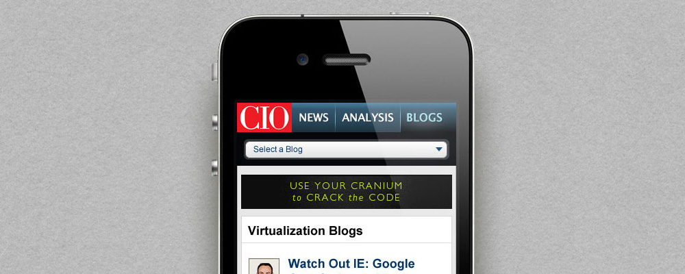
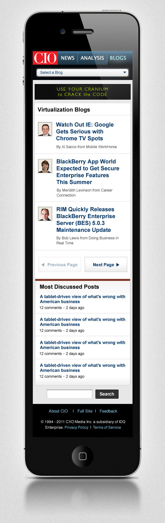
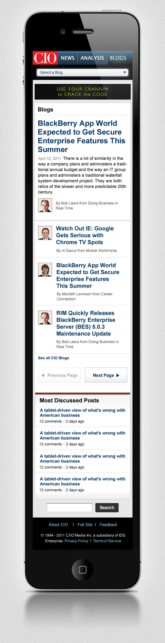
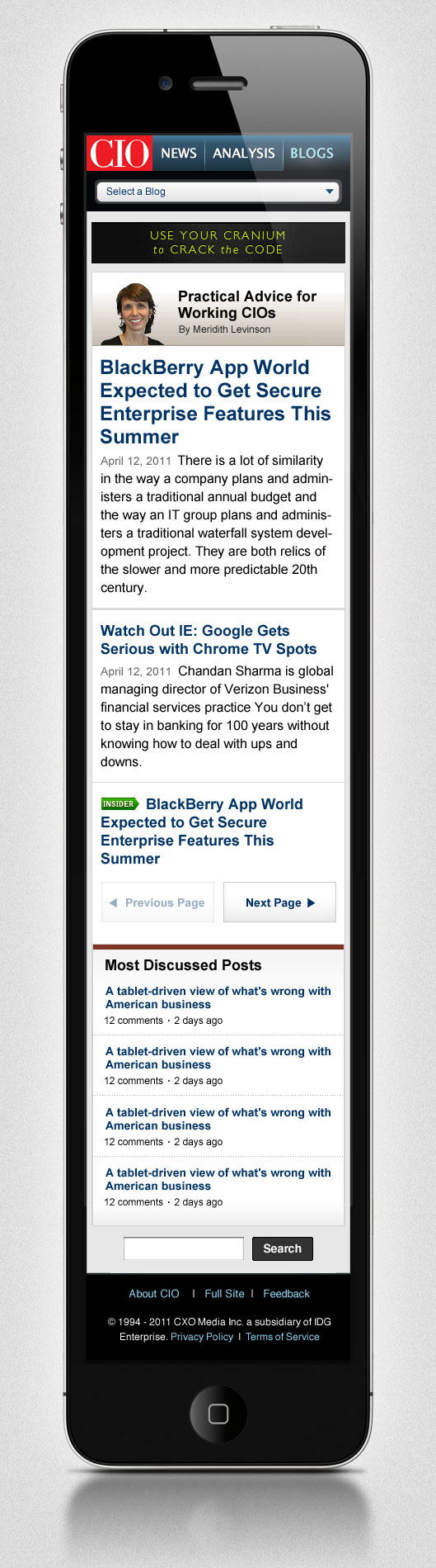
CIO Blogs Mobile
While working at IDG, I was tasked with a complete redesign of CIO.com's popular Blogs website. I built the wireframes and designed the UI for both CIO Blogs Desktop and CIO Blogs Mobile - a site that sees about 15,000 unique visitors/day. I focused on creating a clean, simple layout, with a minimal navigation for ease of use.
-
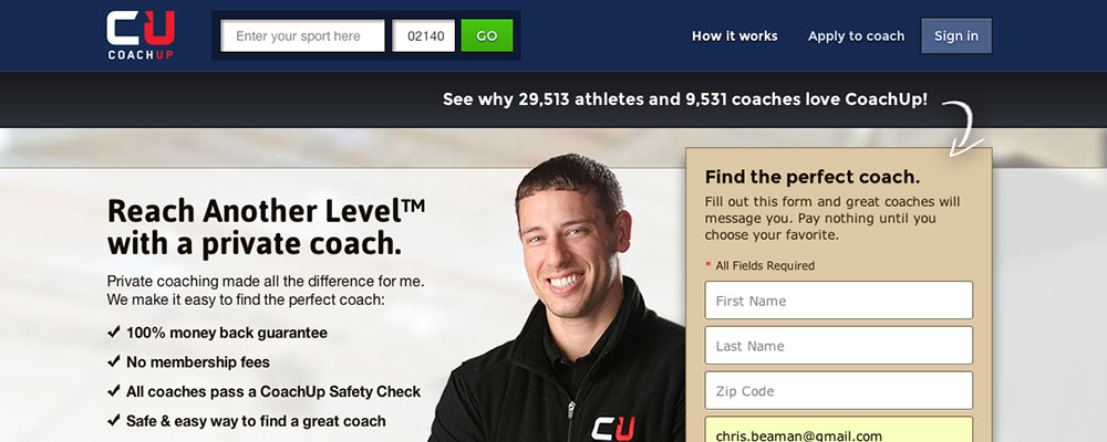
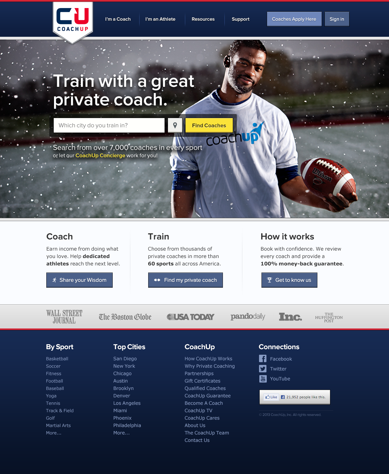
CoachUp Home Page Redesign
At CoachUp, we needed a new home page design after we switched to the "Post A Job" model, popularly used by other two-sided marketplace sites, which consists of a lead-capture/concierge form on the home page rather than an interface that allows the user to search the marketplace. At the time, we had also just undergone a rebranding, so we were still playing with our general look and feel. These are mockups I created to incorporate the new "Post A Job" functionality.
-
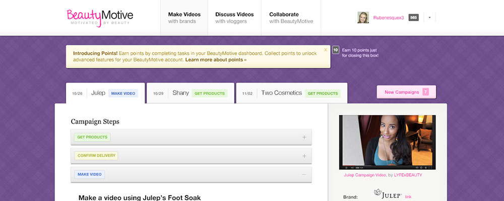
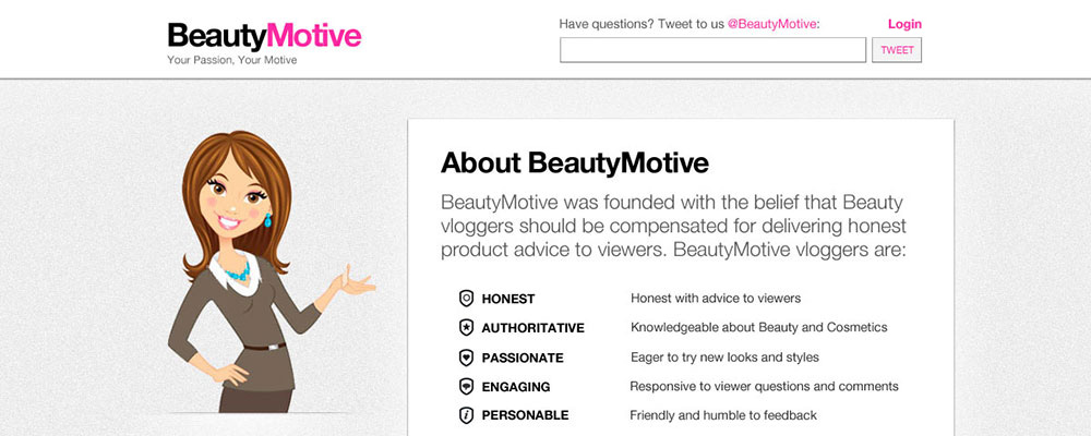
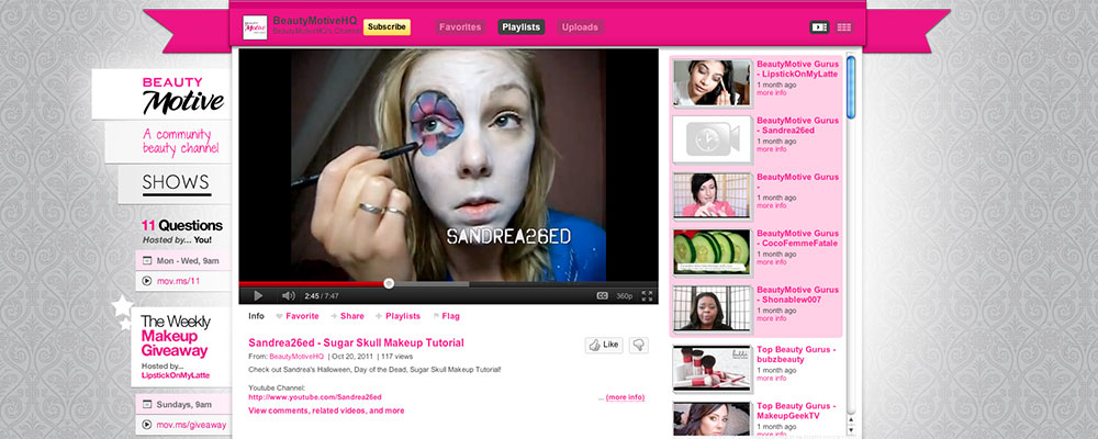
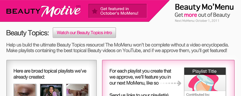
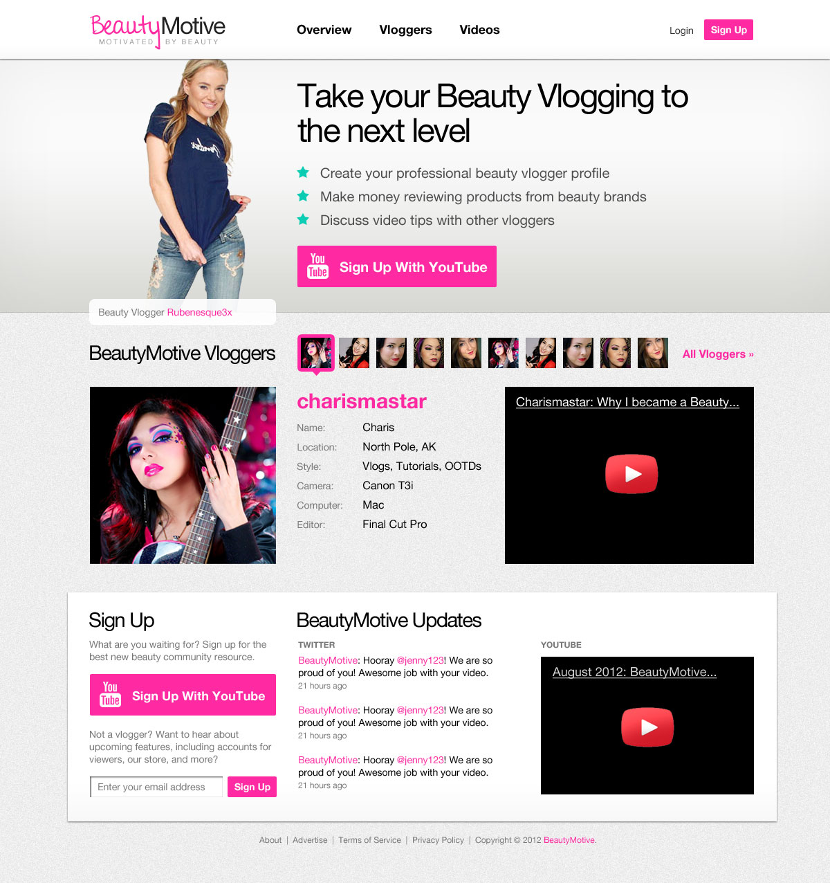
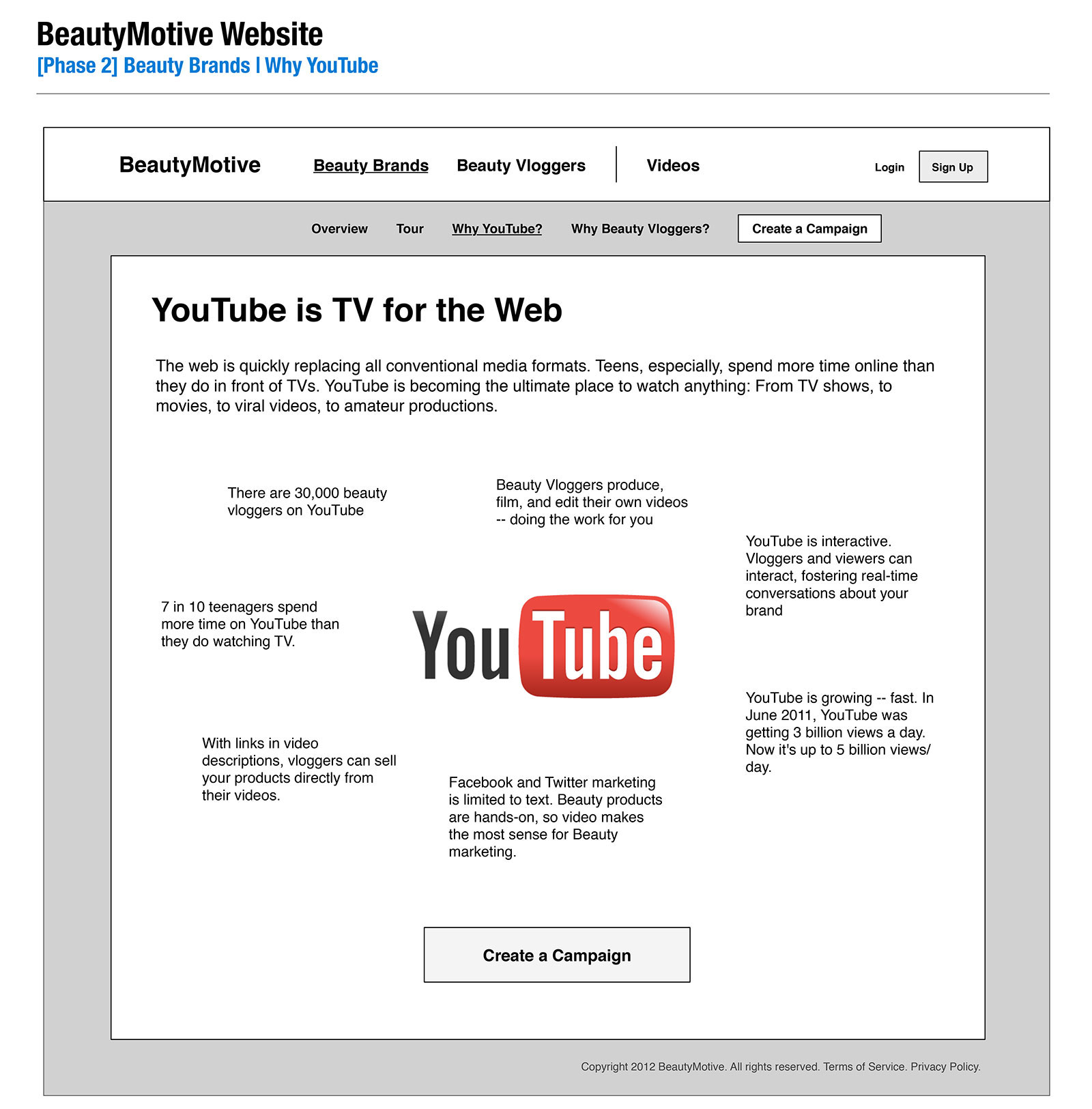
BeautyMotive v3
These are third-round mockups I designed for the BeautyMotive platform. The platform offers YouTubers the ability to find and opt-in to paid promotional video campaigns from beauty and fashion brands. Our web-savvy, predominantly-female audience preferred smooth, colorful layouts that utilize thin, sans-serif fonts and lots of imagery, which is the approach I went for in these designs.
-
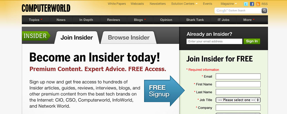
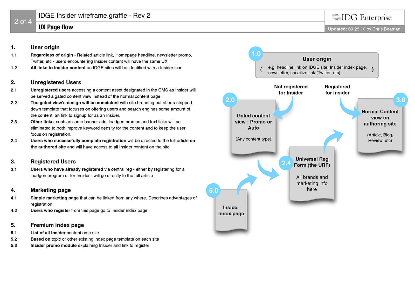
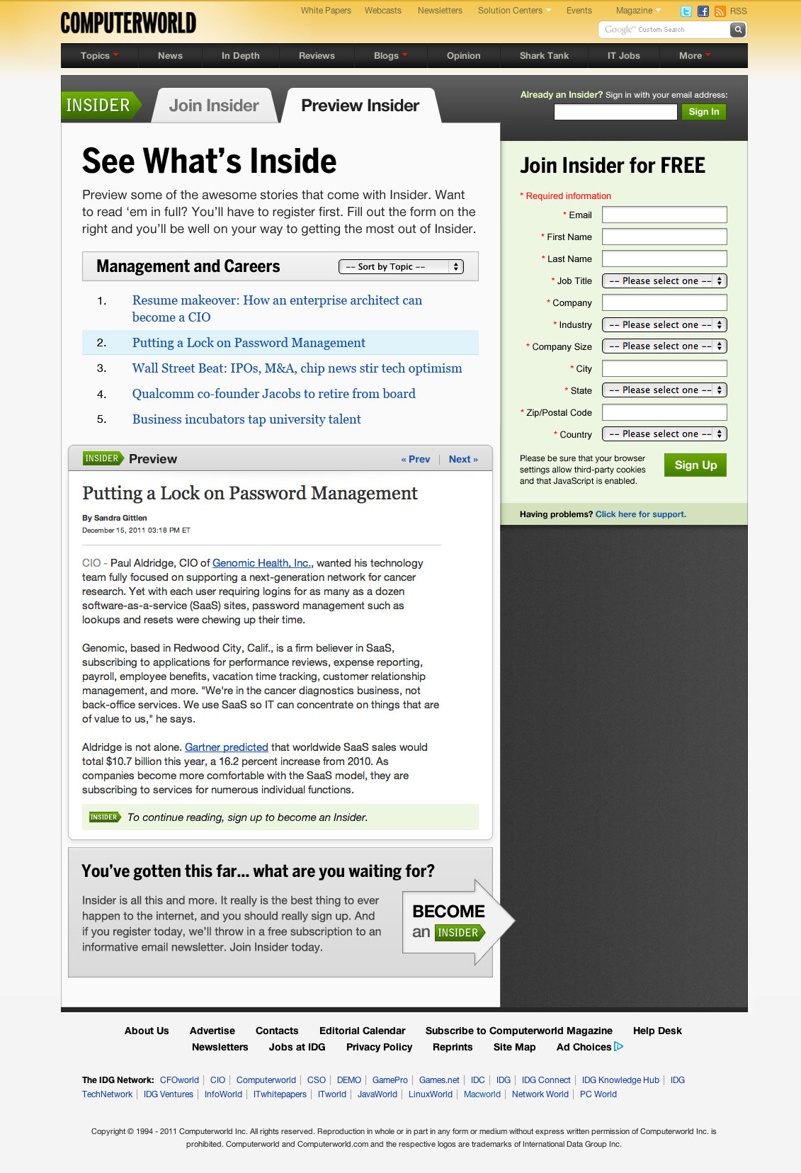
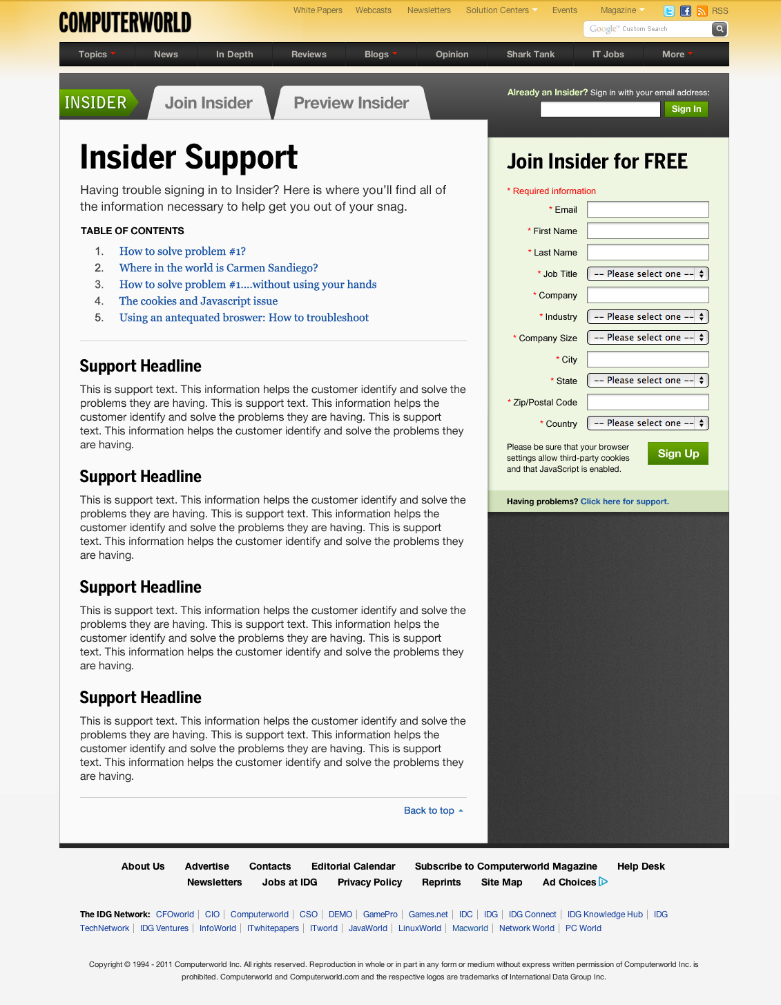
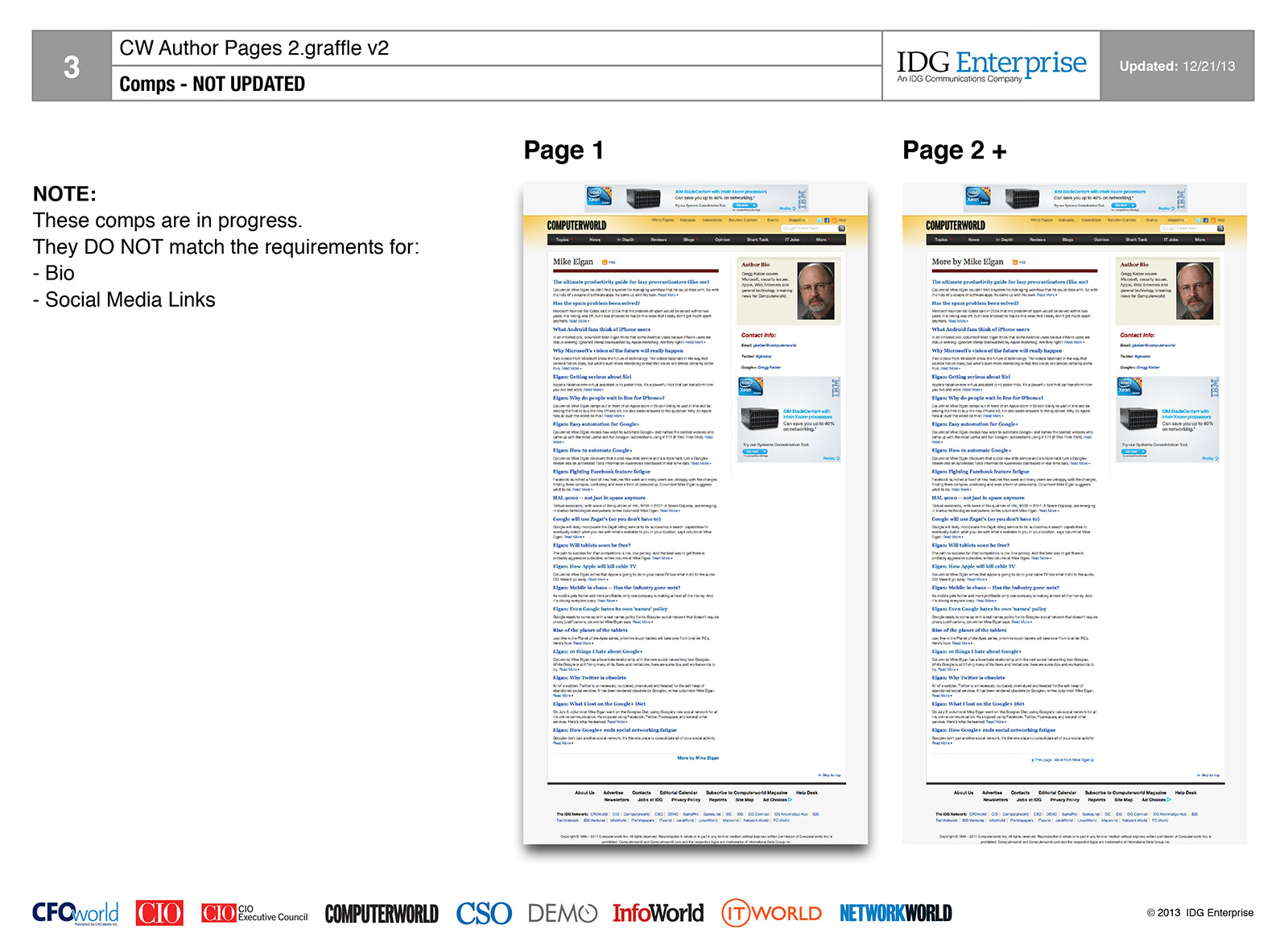
Computerworld Insider Marketing Pages
Back in 2010, when IDG launched its freemium content model, I was part of the branding and implementation team. The first IDG brand we launched on was Computerworld, and these are mockups I did to market our Insider program. The mockups were intended to look fresh and stylish to convey added value to our userbase.
-
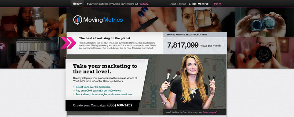
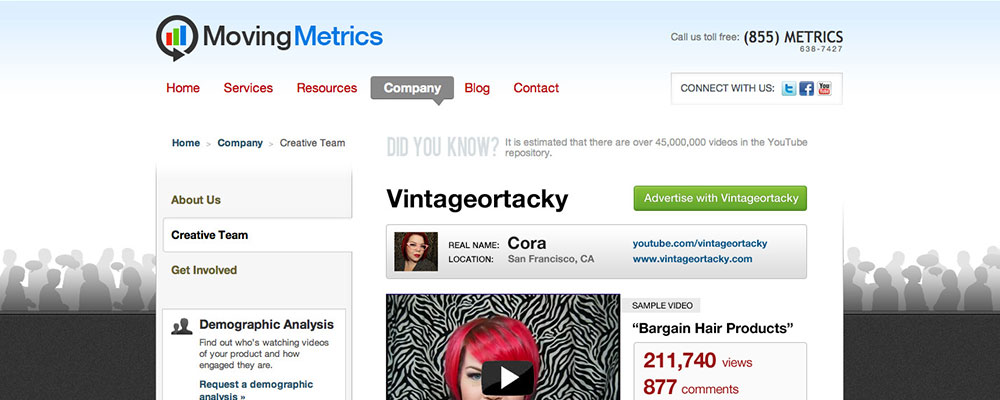
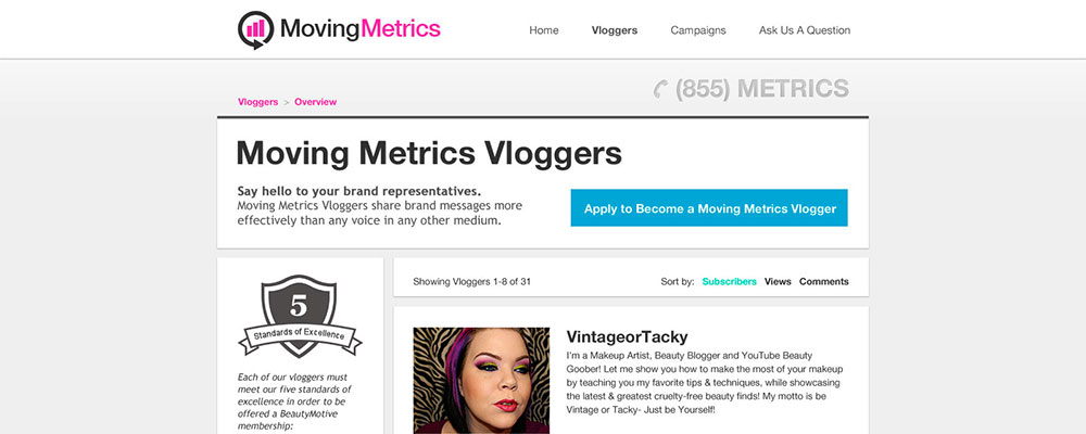
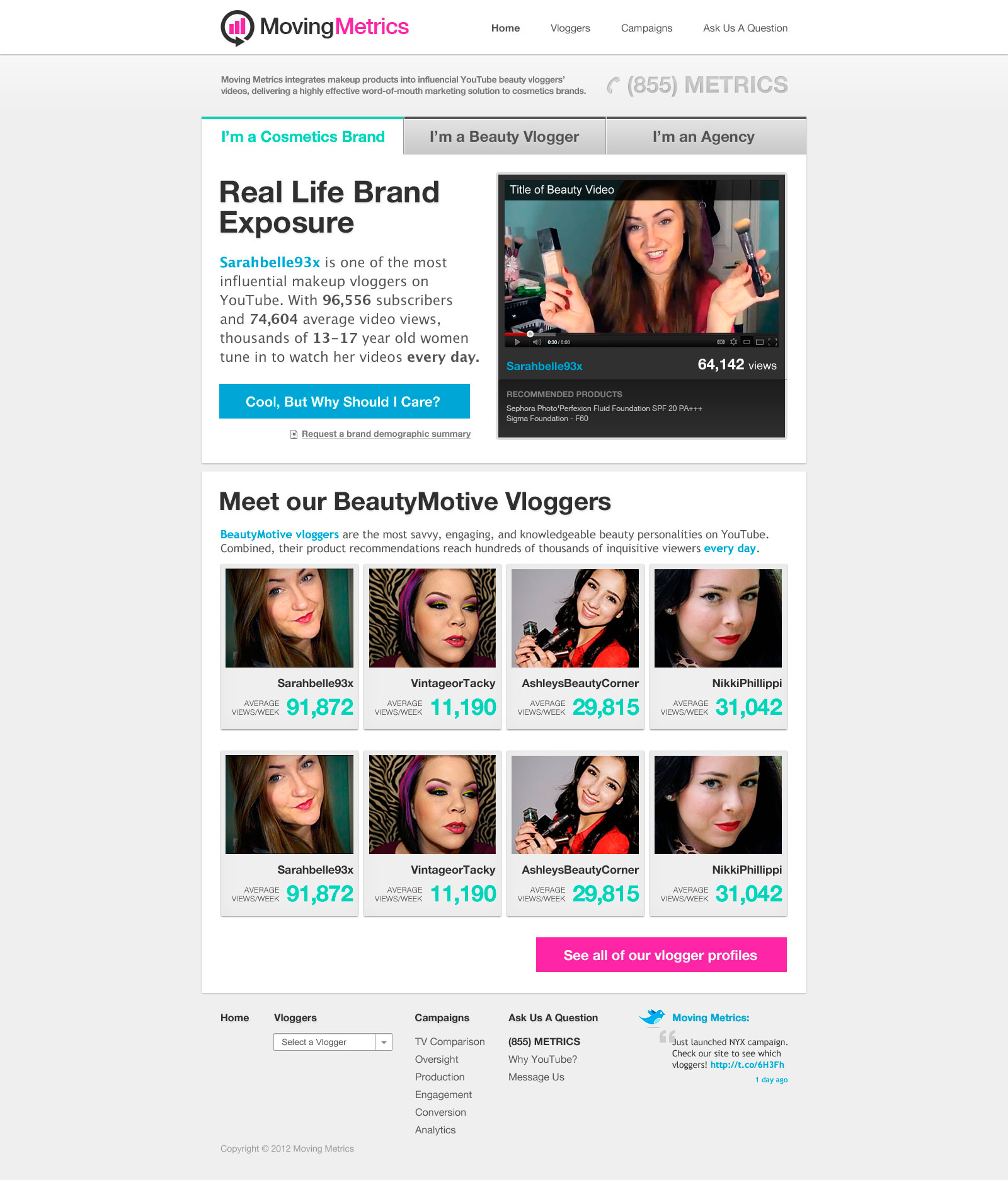
Moving Metrics v3
This is a landing page I designed for Moving Metrics, the brand-focused side of the BeautyMotive platform. The design was intended to be stylish yet clear in conveying the value provided by the service.
-
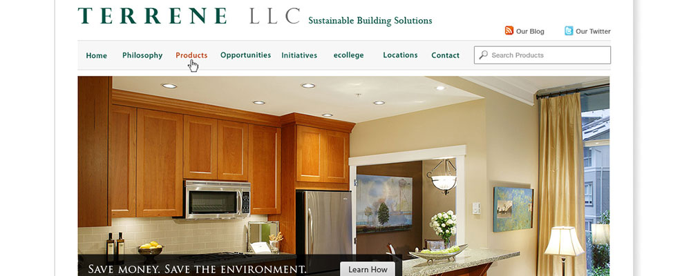
Terrene v2
These are the second round of mockups I designed for the sustainable interior goods manufacturing company, Terrene. Featuring a large, eye-catching image on its home page, the design was intended to pull the viewer in and help them focus on the call-to-action contained within.
-
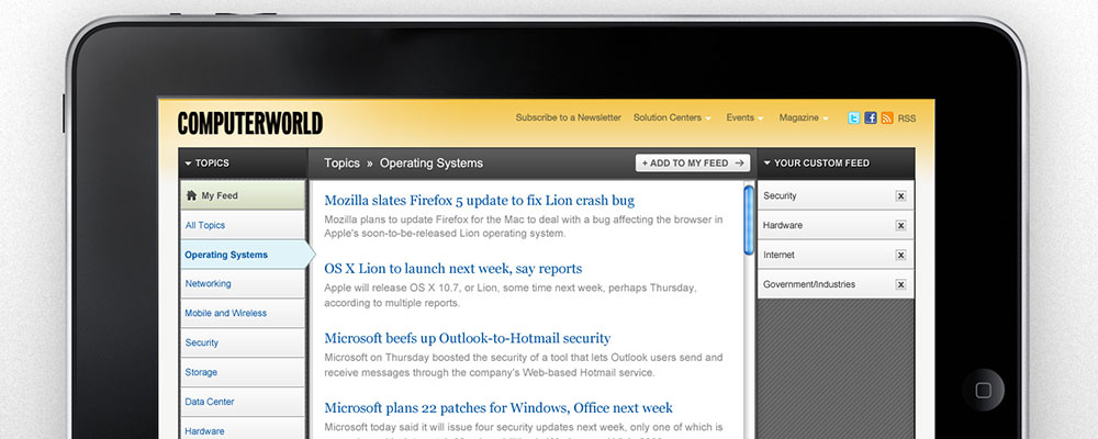
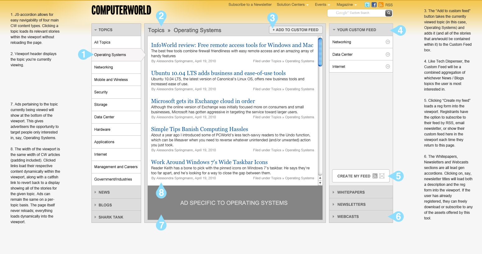
Computerworld Skimmer iPad App
This is a prototype I designed for Computerworld at a time when we were exploring building an iPad app to resemble the New York Times' recently released Skimmer tool. The app was intended as a lead-gen app that pairs the functionality of Computerworld's website as well as IDG's Tech Dispenser web product. I aimed to create an interface that would allow advertisers to serve ads while simultaneously allowing us to serve premium, gated content.
-
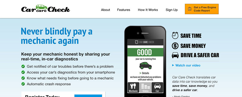
Car Care Check
I designed and built the the initial website for Car Care Check (now called Jaze), a service that helps diagnose car problems for drivers. Our design approach was meant to convey a sense of stress-free car-management to folks who may not know a lot about cars or car maintenance (like myself).
-
BeautyMotive v2
These are a couple of the designs I did for v2 of BeautyMotive's Visual Design. I went with a simple approach with lots of white space and gentle shadows to follow in the footsteps of other beauty and fashion sites with a similar aesthetic.
-
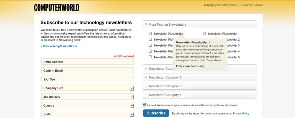
Computerworld Newsletter
Each of IDG's brands (Computerworld, among them) feature a host of topic-specific newsletters. We were constantly A/B testing different designs on different newsletters reg forms, and this was a design I did for the Technology newsletter sign-up page. The design aimed to simplify what was once a long page of form fields and additional newsletter options. Alas, this design didn't perform so well (users preferred the traditional approach without accordions) but nonetheless it was a valuable design project.
-
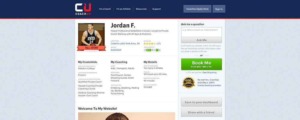
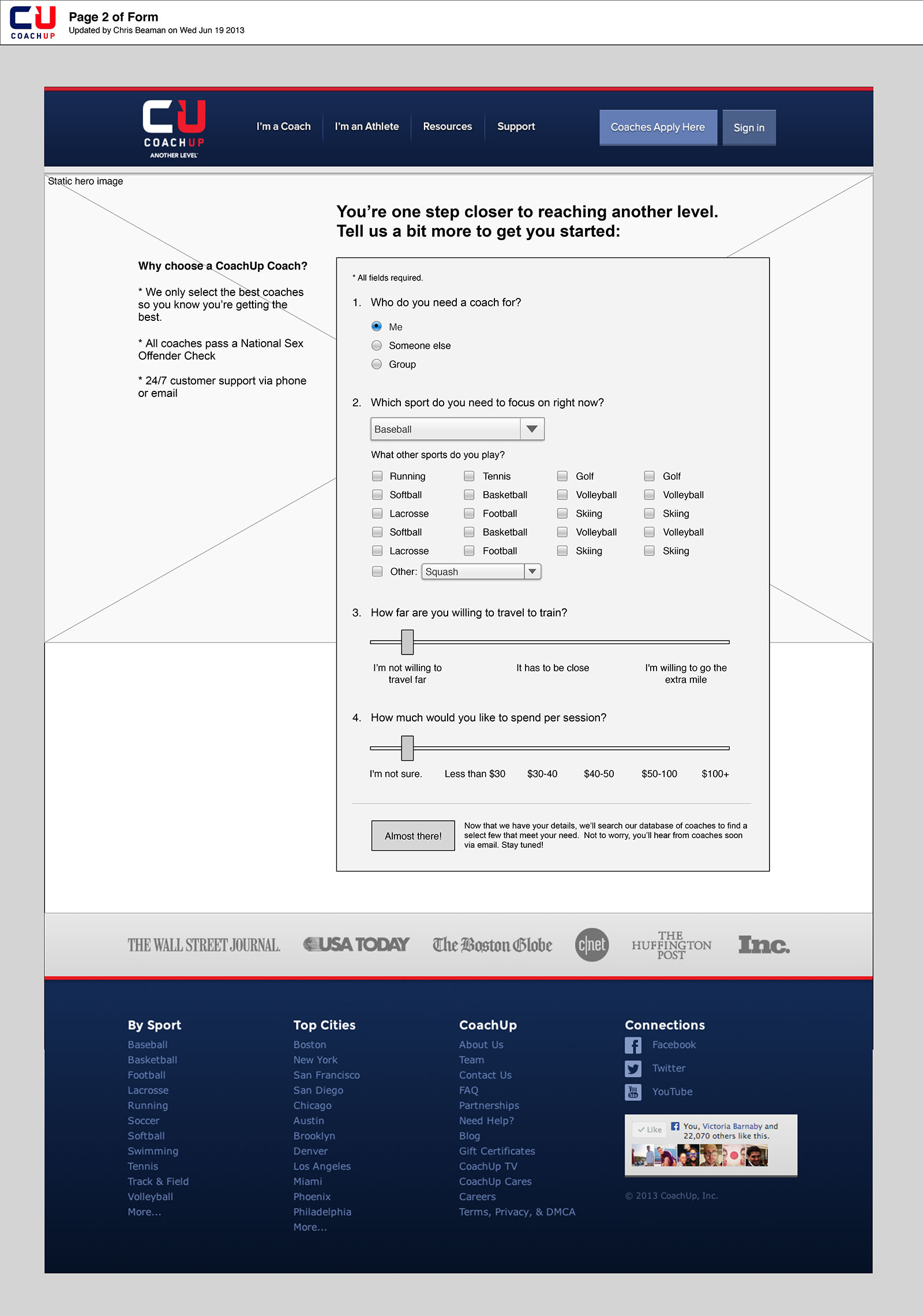
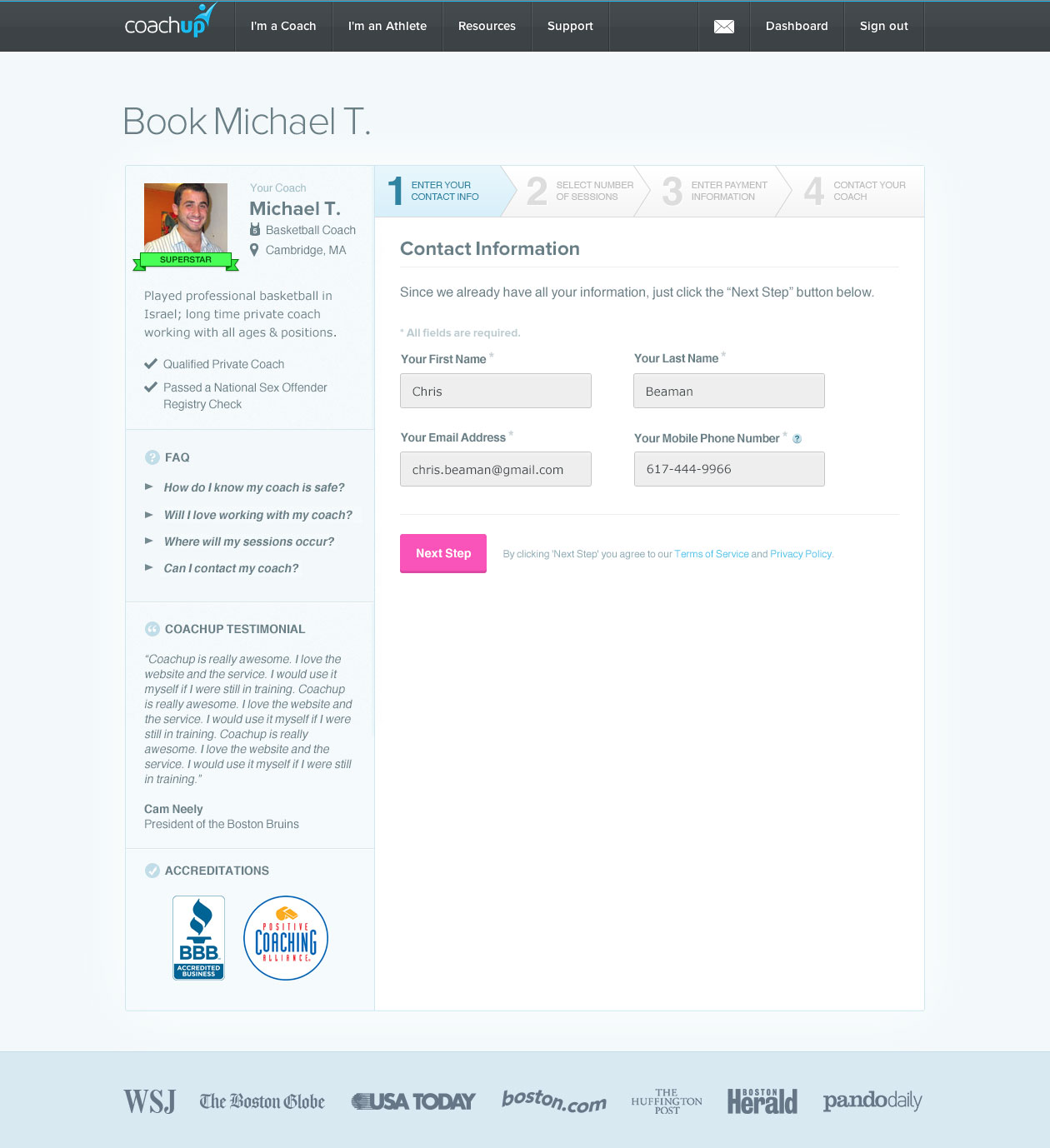
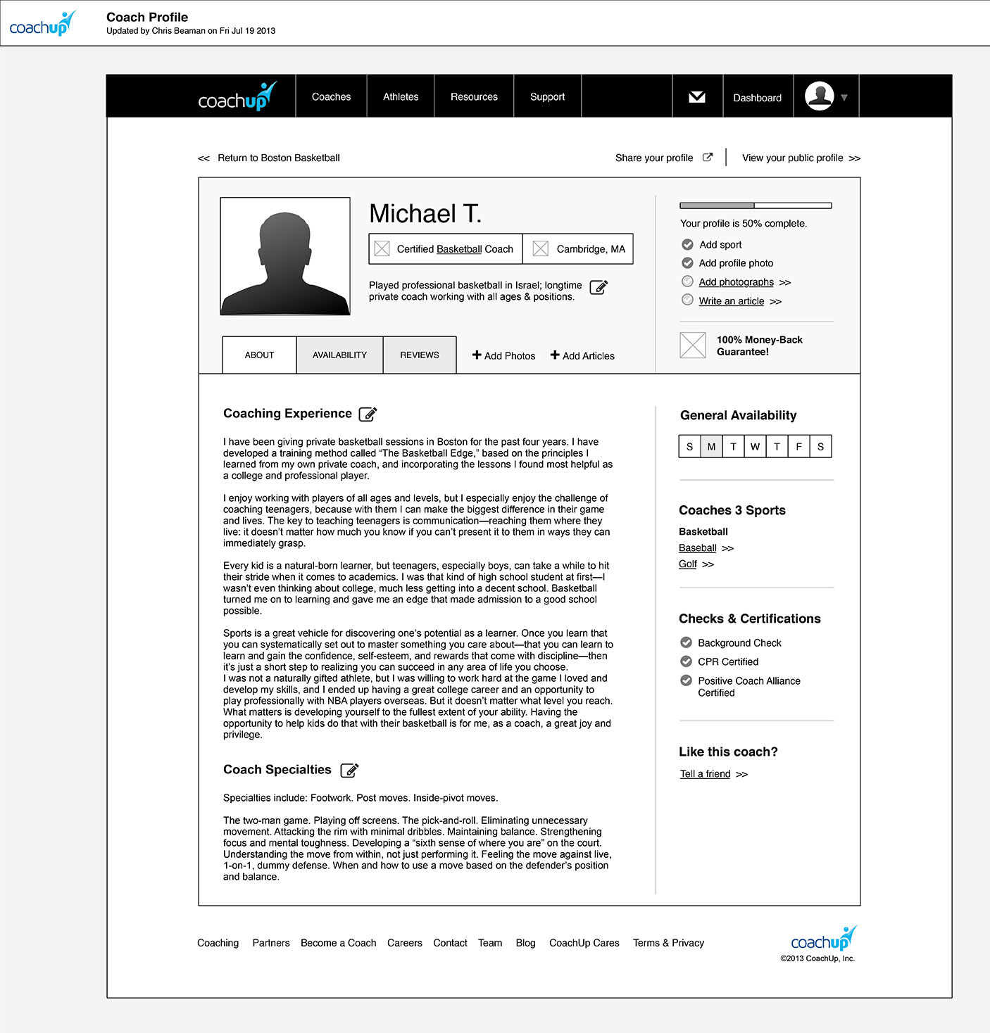
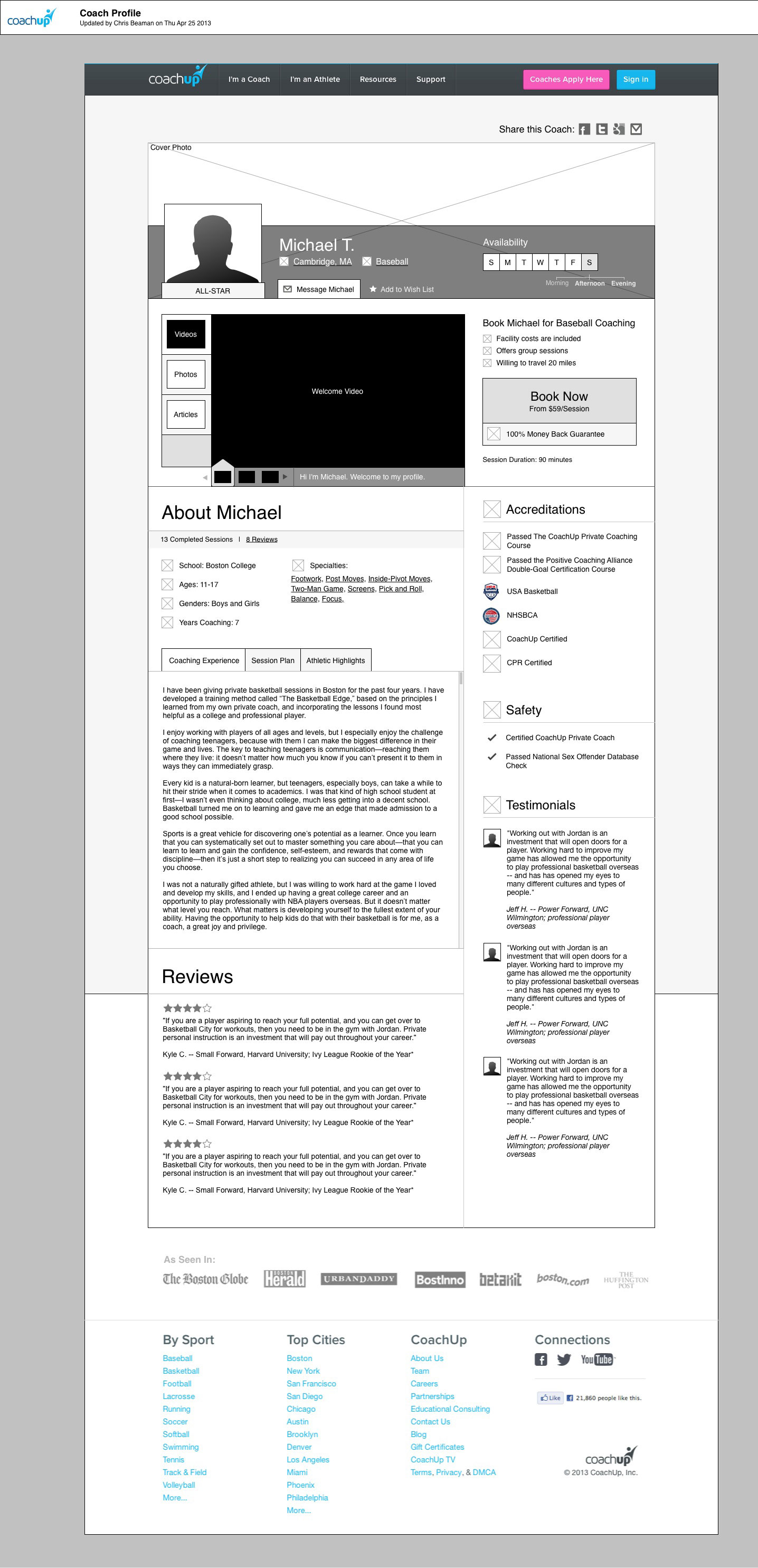
CoachUp Coach Profile
These are a series of mockups I did for CoachUp's coach profile. While undergoing this project, I also played a role in the information architecture process, determining which content to display to users, using which language, etc. One challenge with these designs was putting the focus on our main call-to-action despite having so much other text on the page.
-
Moving Metrics v1
Back in the early days of Moving Metrics, we billed ourselves as video production specialists before going the route of a full technology solution. We teamed up with video-production-savvy YouTubers who became extensions of our Creative Team. These are first-round designs I did for the Moving Metrics content site.
-
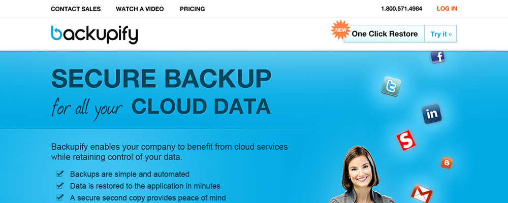
Backupify
This is a prototype design I did for Backupify at a time when I was vying for a position there. I attempted to take what I thought was a flat and rather dull design and give it life through the inclusion of a human character and bright colors/graphics.
-
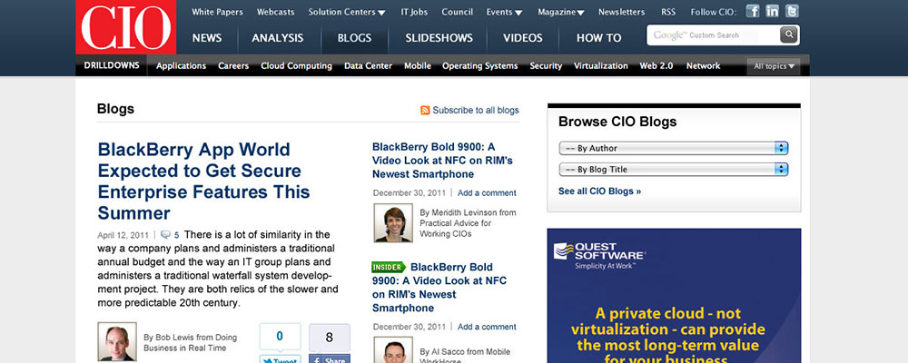
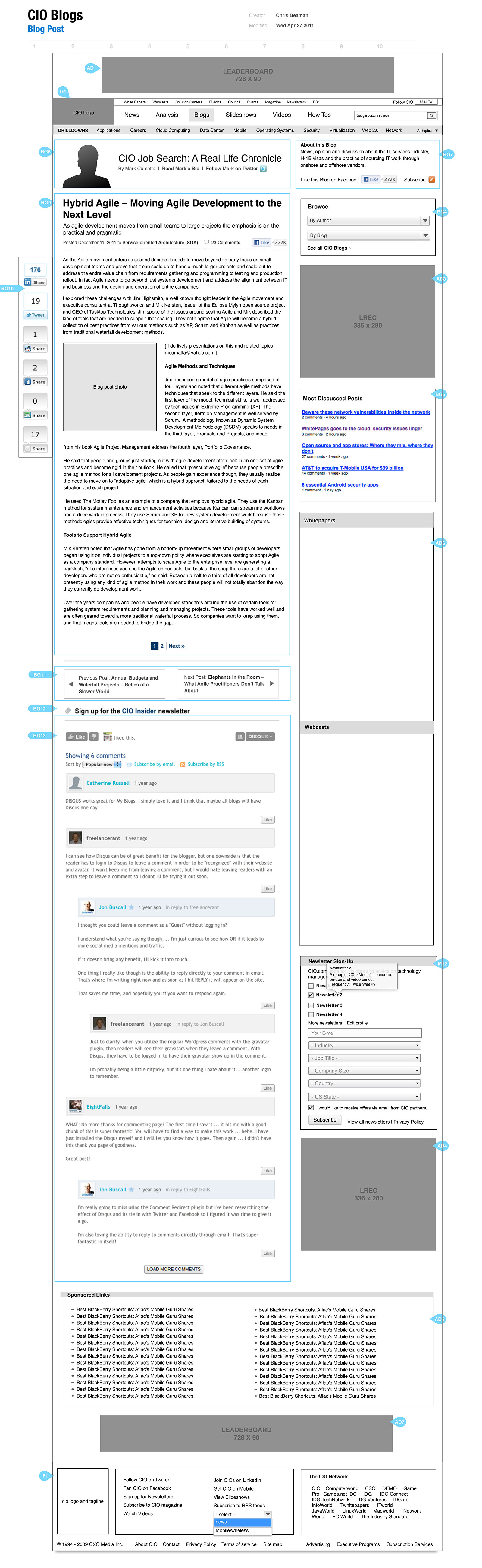
CIO Blogs Desktop
This is the desktop site design I did for CIO Blogs, in advance of the mobile design shown in my portfolio above. The design offered CIO bloggers a cleaner presentation for their content, as well as better bio pages and more focused taxonomy pages.
-
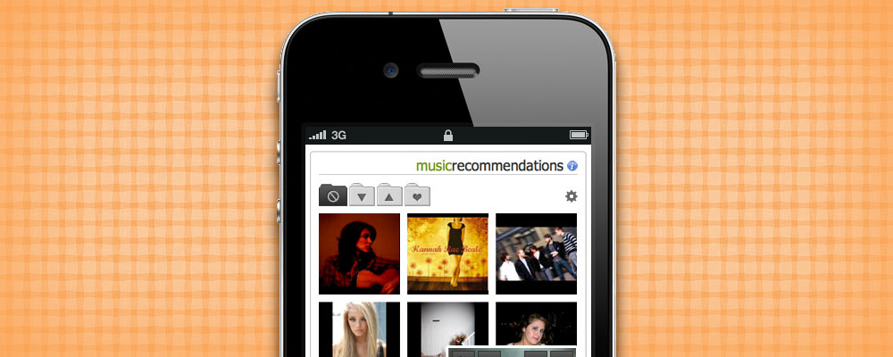
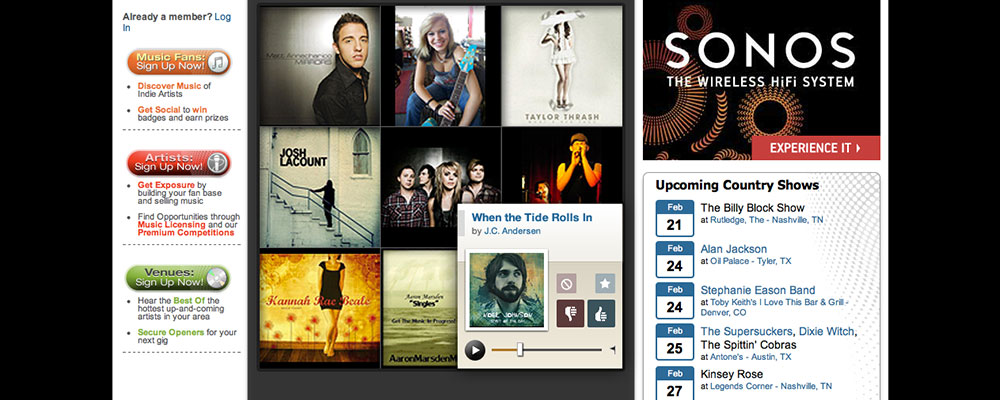
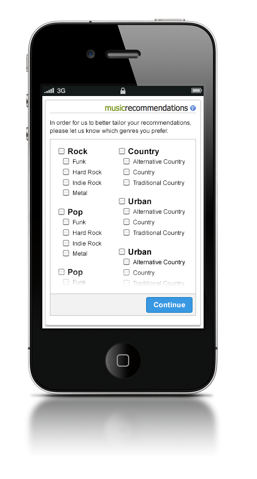
OurStage Mobile Recommendations
OurStage is a music-recommendation and discovery platform for emerging artists, whose algorithms are based on a music-ratings system. They needed a new web and mobile UI for their recommendations tool. These are several in a series of draft mockups to improve the look and feel of that tool.
-
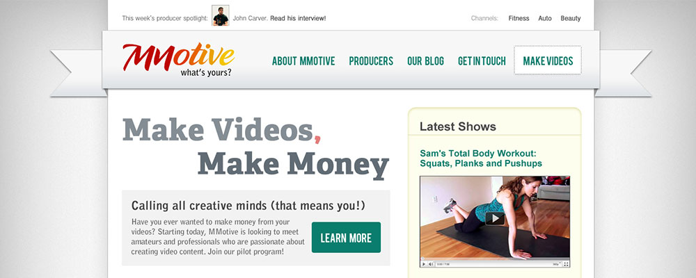
MMotive Landing Page
MMotive was an experimental off-shoot of Moving Metrics prior to the creation of the Motive sub-brands. Featuring the once-popular header ribbon approach, this design catered toward young, web-savvy users with its slick shadows, rounded corners, and bright colors.
-
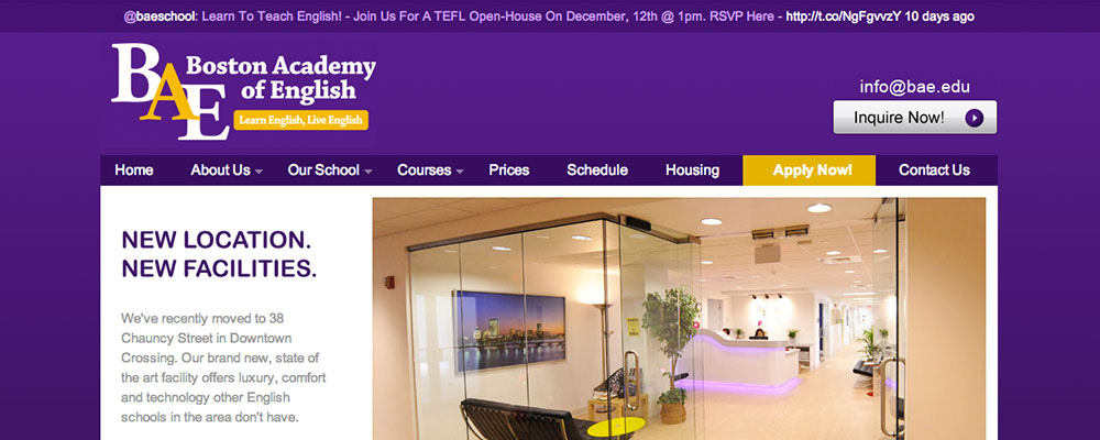
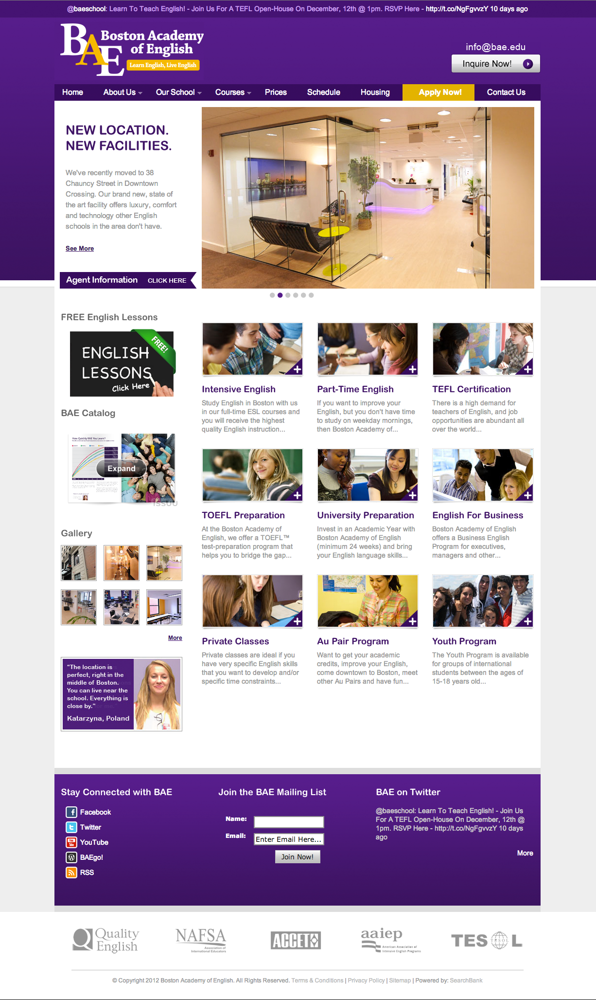
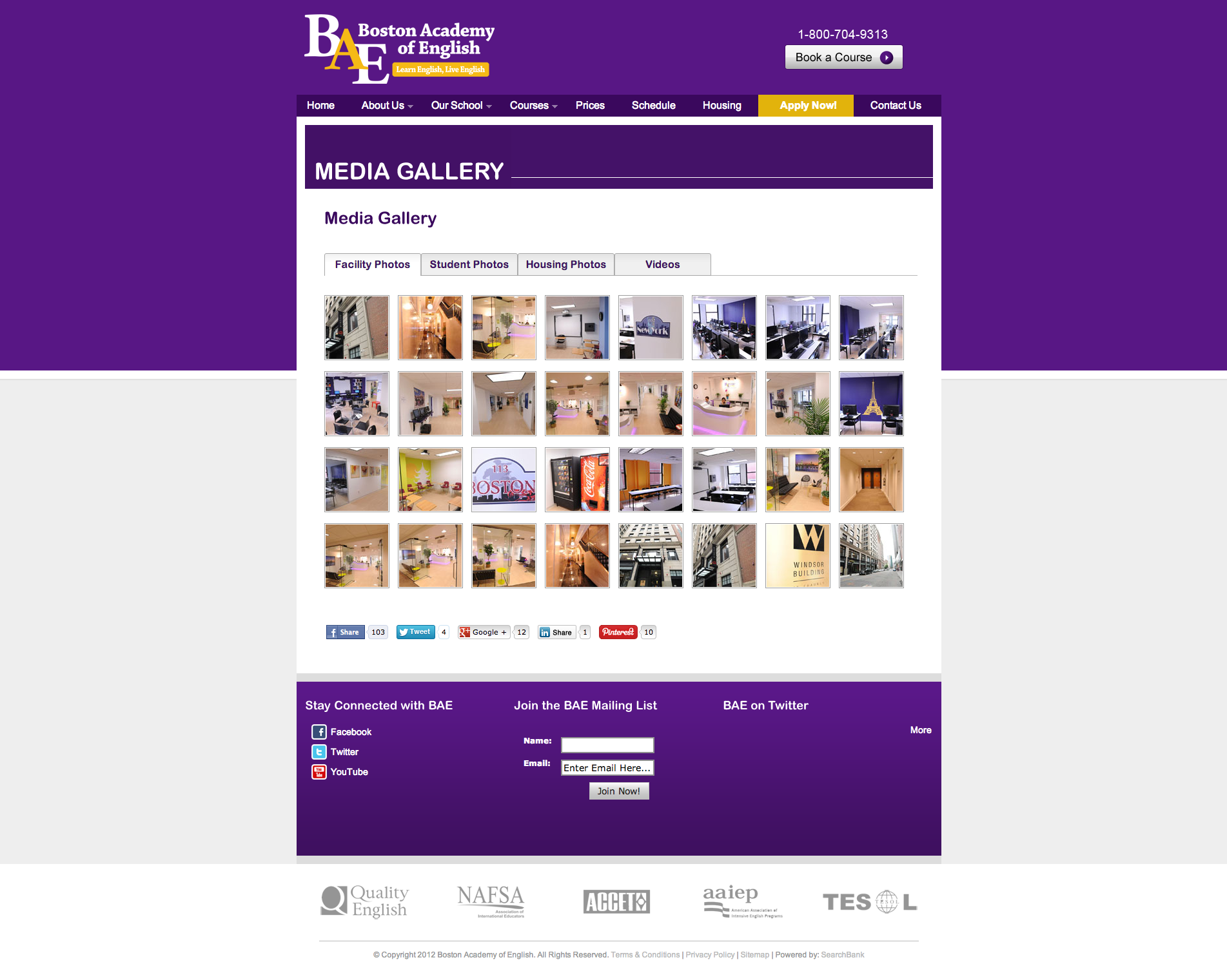
Boston Academy of English
In its process of switching building locations, BAE decided to rebrand itself with a new, cleaner design and better access to content. I created this design with the hopes of luring would-be English-speakers using lots of professional imagery and a slick carousel to showcase BAE's beautiful new property.
-
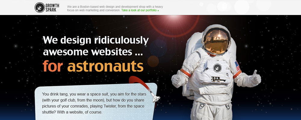
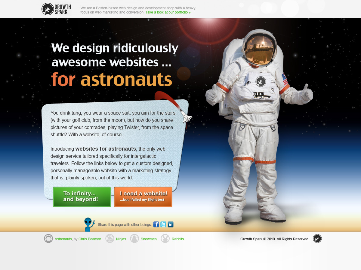
Growth Spark - Astronauts
This design was part of a series of fun marketing pages aimed at small business owners. In addition to designing this landing page, I also ran a Facebook ad campaign to draw visitors to the page. The design pokes fun at niche-specific landing pages by isolating a very improbably crop of users - astronauts. Other intended series pages included Ninjas, Snowmen, and Rabbits.
-
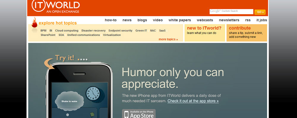
ITWorld Help Desk
One of my first design projects at IDG was mobile screens and a landing page for a mobile app called ITWorld Helpdesk - a simple "Magic 8-ball"-type app that would display funny help desk quotes at the shake of the device. Sadly, the app never launched, but the design process was fun.
-
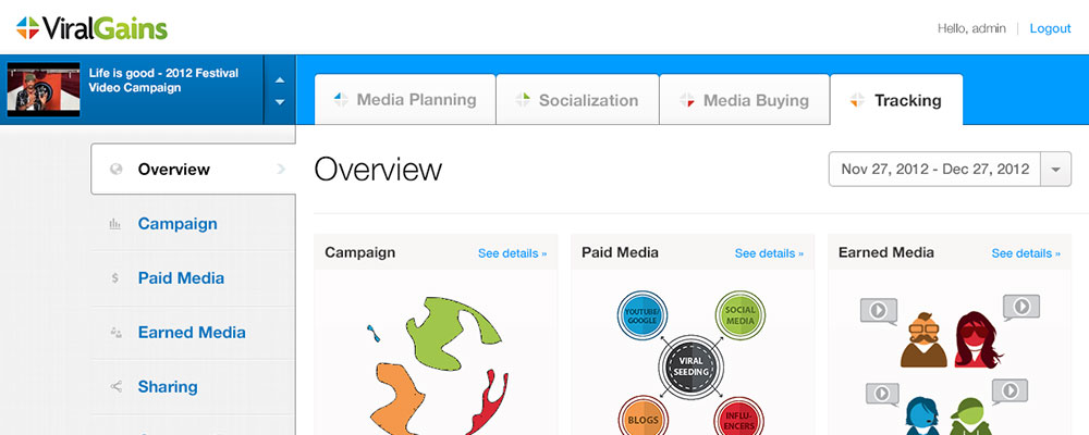
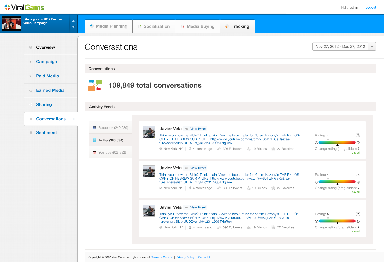
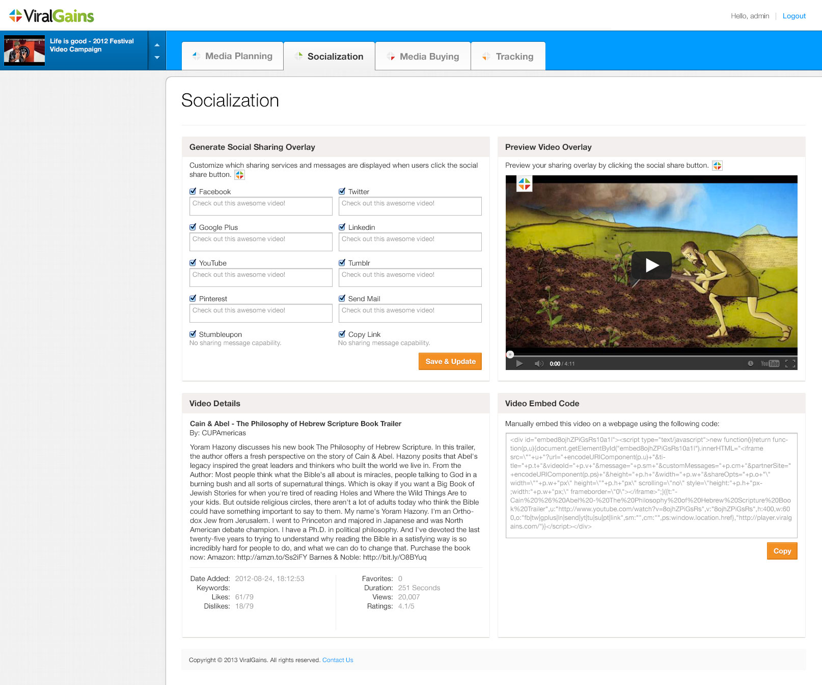
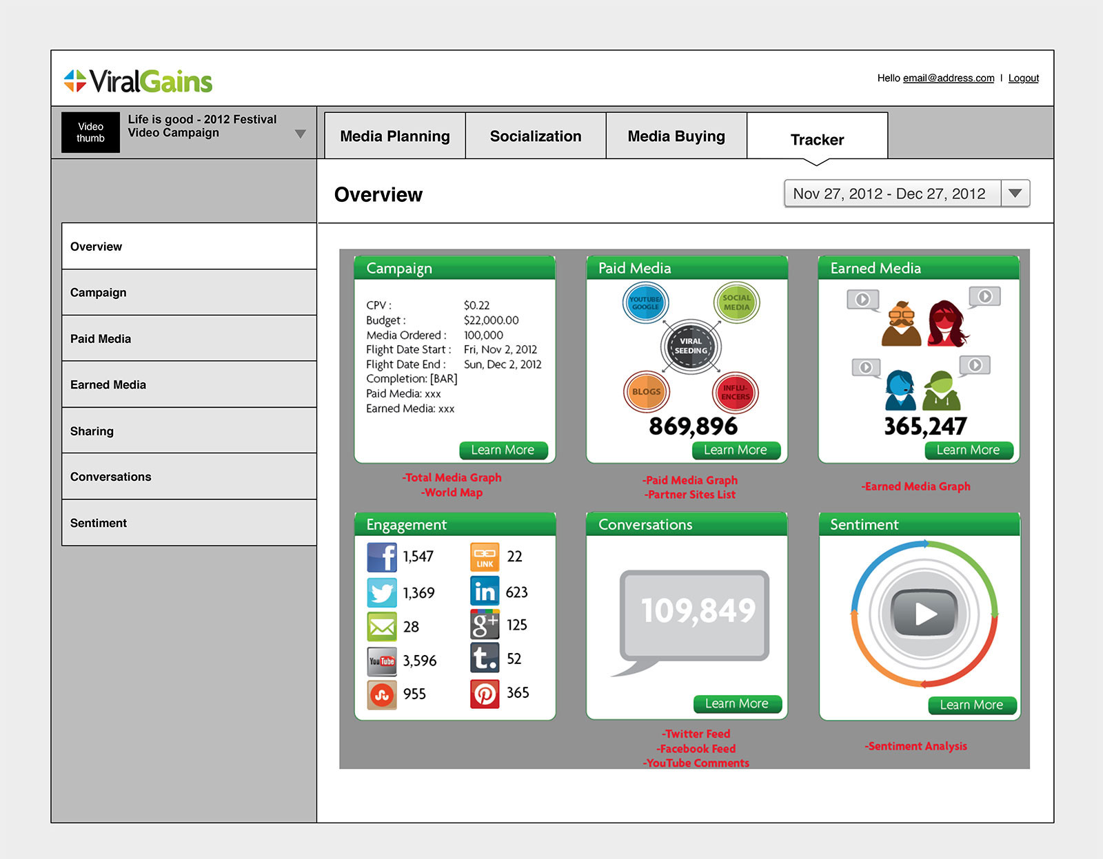
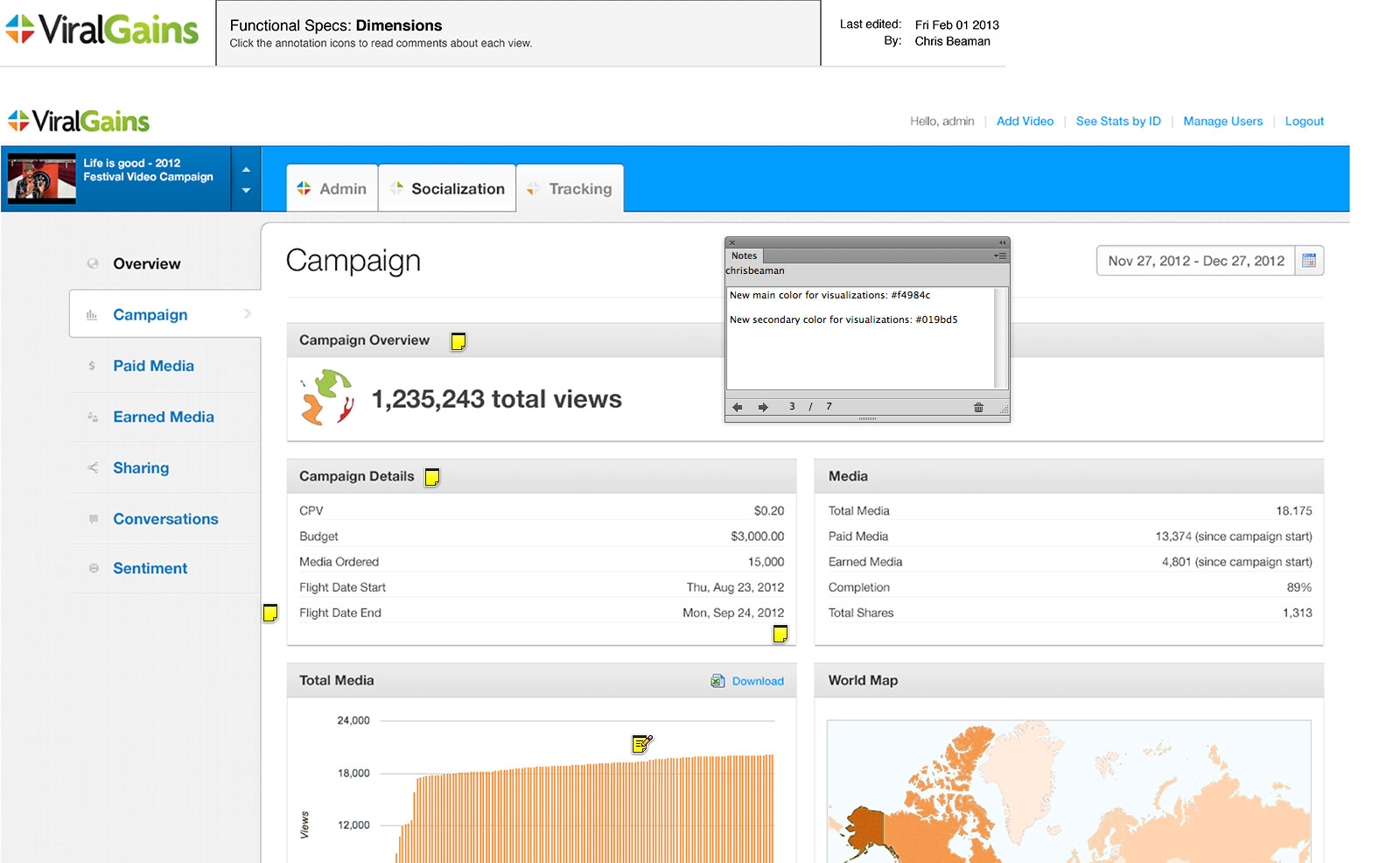
ViralGains Dashboard
I gave ViralGains' dashboard UI a fresh coat of paint to help make their platform more marketable to brands. The UI features a flexible layout meant to accommodate screens of varying size. While working on the project I also played a role in the information architecture process, helping to determine the order of top-level navigational items as well as their sub-menus.
-
Moving Metrics v2
Building off of the v2 design for BeautyMotive, I designed Moving Metrics' brand-focused site to feature a consistent UI, with lots of white space and bold, bright colors. These are a series of mockups I did for various pages of the marketing site.
-
OurStage Desktop Recommendations
This is the desktop variant to the mobile music recommendations design above. Users would come to OurStage, be prompted to listen to songs by emerging artists, and then vote on which song they preferred more. The preferred songs would rise or fall in rank based on these votes.
-

Terrene v1
This is one of the first Visual Designs I did while contracting for Growth Spark, back in 2009. The client was Terrene, a manufacturer of sustainable home products. The client specified that they wanted a fresh design with a unique look-and-feel, which I attempted to deliver, using lots of green tones and an overlapping sidebar.
-
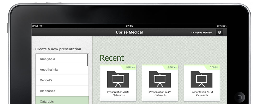
Uprise Medical iPad Prototype
Uprise Medical (now Centrana Health) needed a prototype of its product, designed as an iPad app. I designed this interface to accommodate both the iPad 1/2 and the iPad Retina, with graphics sliced for each.
-
BeautyMotive YouTube Channel
Back when Google allowed custom designs on YouTube channels, I designed a series of channel skins for BeautyMotive's YouTube presence. These are two of the more progressive designs, featuring listings of BeautyMotive scheduled programming, as well as hosts for the channel.
-
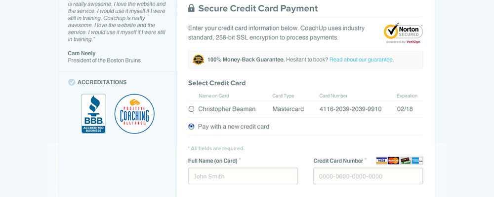
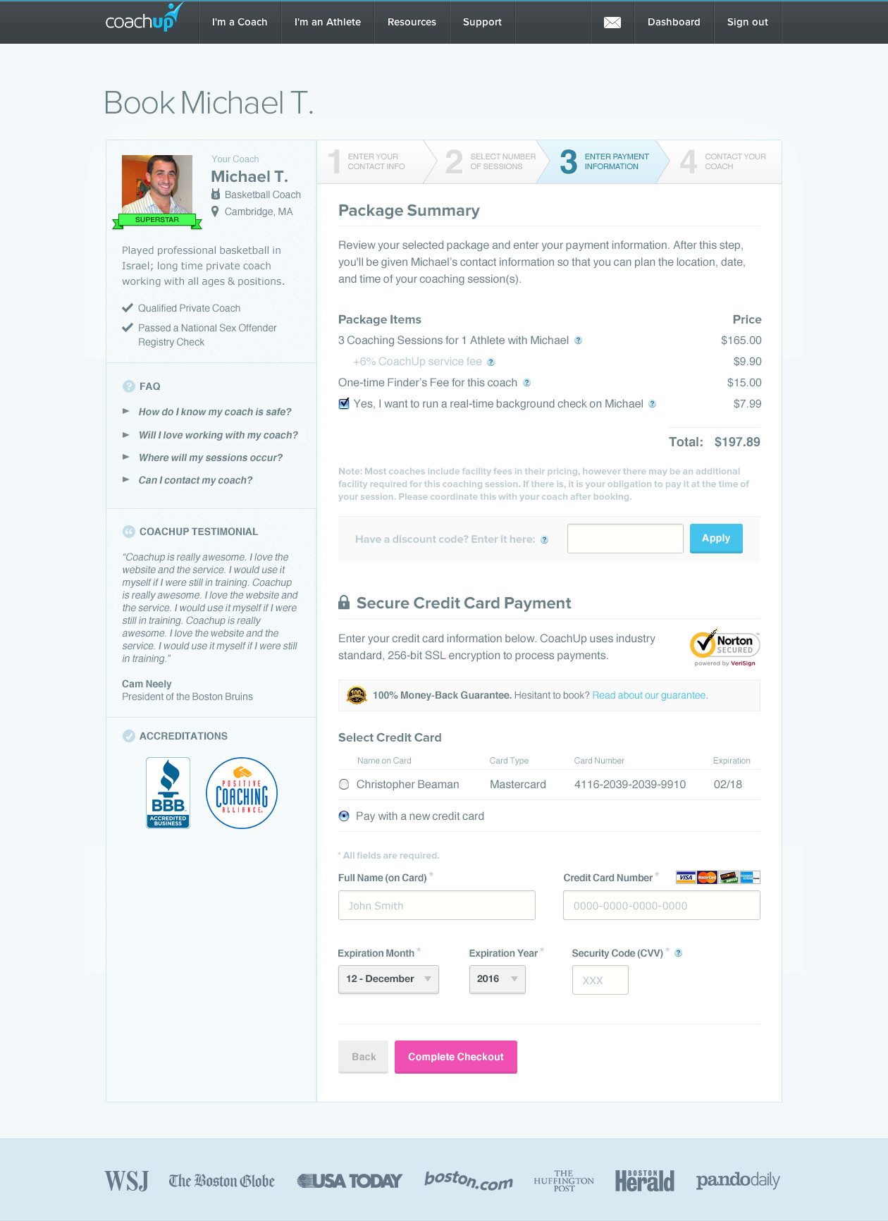
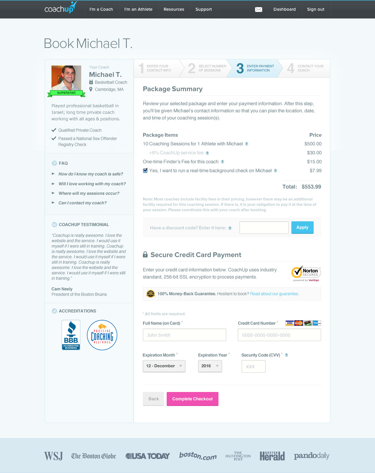
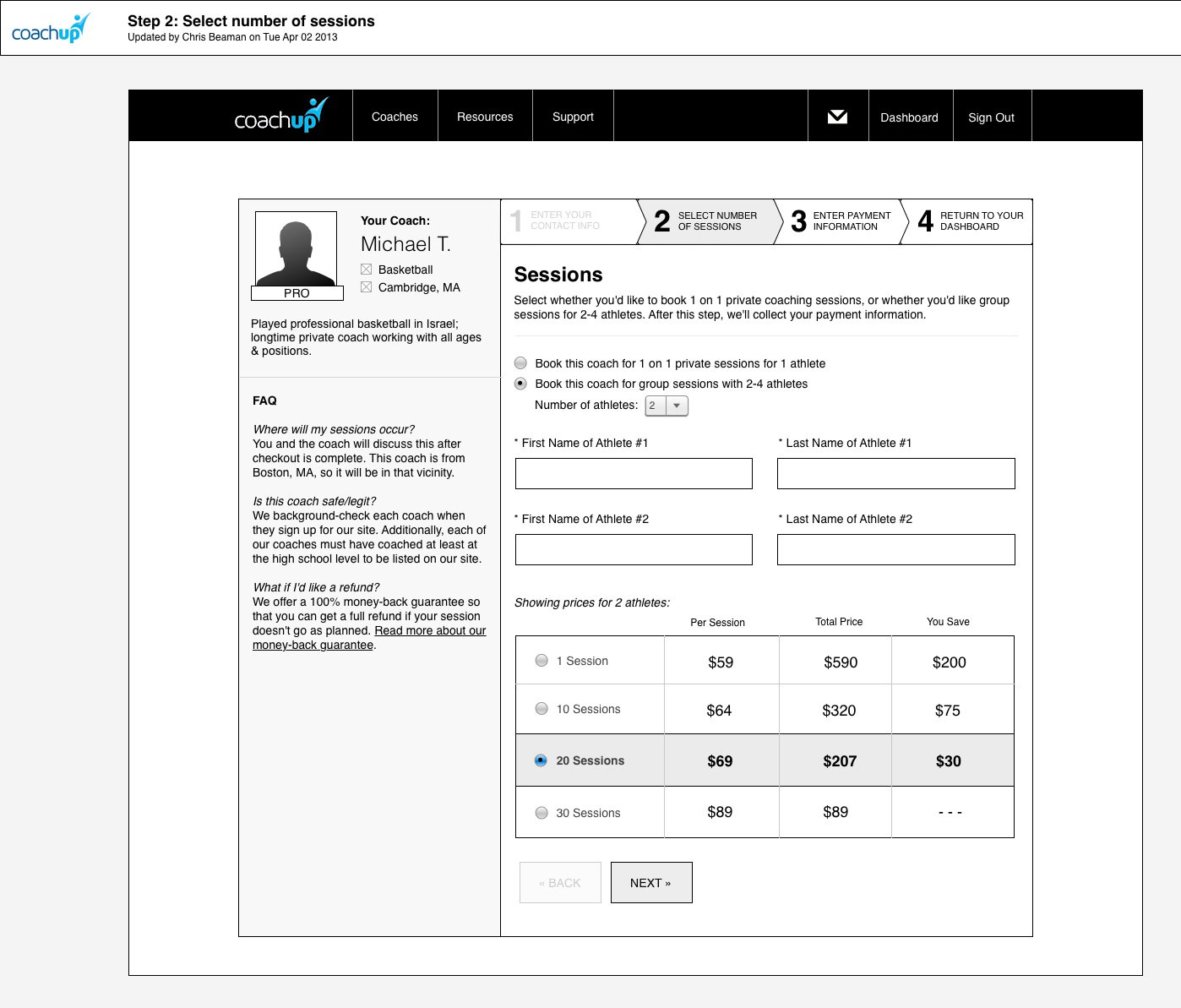
CoachUp Checkout Flow
One of the first things I redesigned after joining CoachUp was our checkout flow, which needed a new UI for processing payments, as well as entry points to let existing users make repayments. This design features a stepped approach, with lots of value points made throughout the flow to drive home CoachUp's underlying value (and convince users to follow through with their purchases).
-
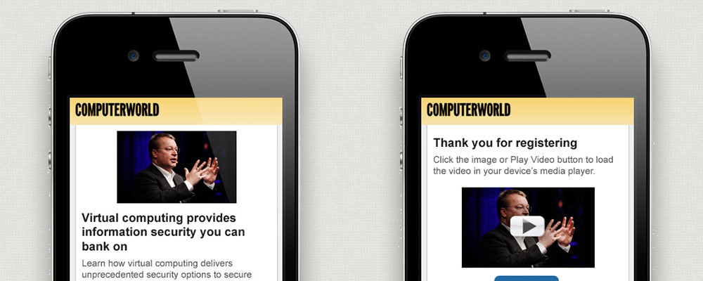
Computerworld Mobile Video
These are a couple of mockups I made to help freemium users gain access to gated video content on Computerworld. The designs echo Computerworld's signature yellow background and blue-button aesthetic.
-
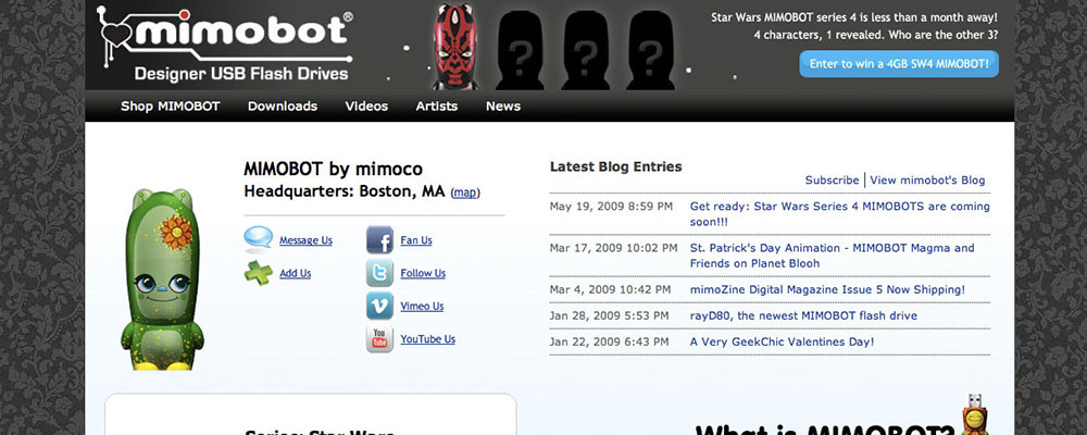
Mimoco Info Page
This was a landing page I designed for Mimoco that intended to inform new users about who Mimoco was, as well as introduce them to Mimoco's line of Mimobot character-based flash drives. I both designed and coded the page, using tie-ins to our Magento eCommerce platform and Mailchimp newsletter system.
-
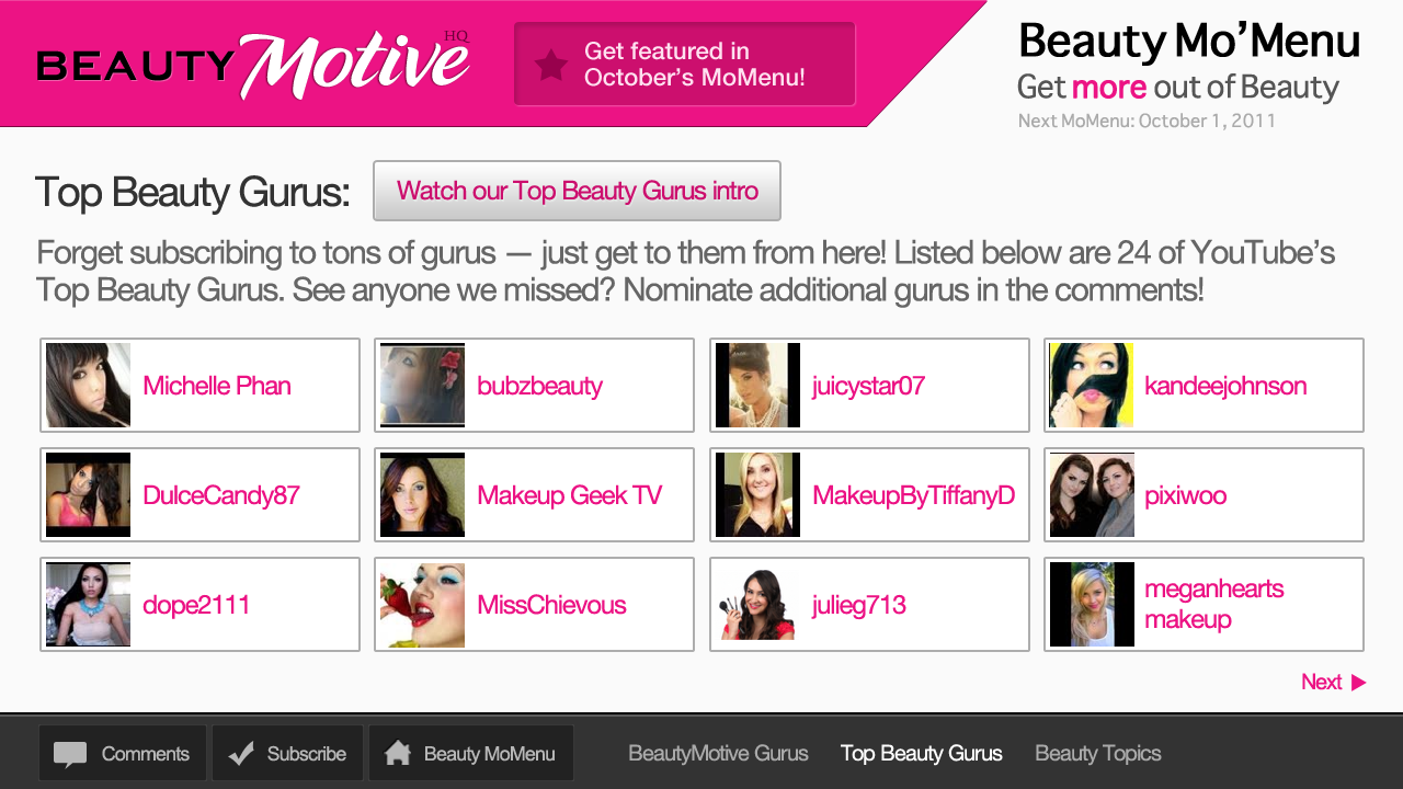
BeautyMotive MoMenu
While at Moving Metrics I came up with this idea for a video-based channel guide, where users watching our "MoMenu" videos could click linked annotations to be redirected to other videos. The "video" was little more than a slideshow with YouTube annotations layered on top of it. Here are a few of the mockups I made for the slides.
-
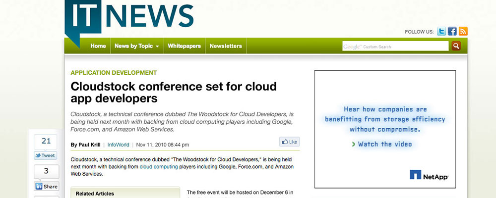
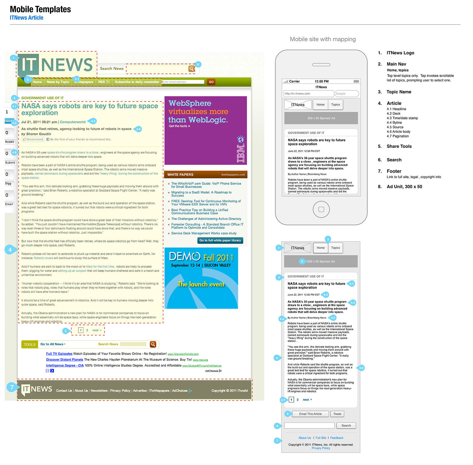
IT News
These are a couple of designs I did for IT News to enhance their site's visual presence and boost reader registrations. While among the family of IDG sites, IT News was the only pure content aggregation site, with no original publishing of its own. As such, readers often found IT News after searching Google for the term "it news." My challenge was to make the site look lively enough that readers would feel compelled to register for gated content.
-
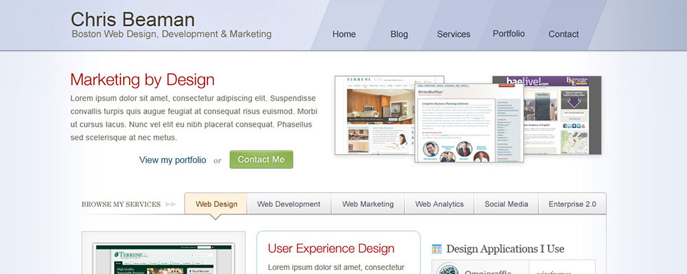
ChrisBeaman.com
See my portfolio sites from the past: These are mockups from prior iterations of my own website.


